
3.2 ggplot2: Geoms
Choose the geom from the variables: points, smooths, histograms, densities, boxplots.
1. Smoothing: geom_smooth()
A smooth line is a way to see a trend. The default is a loess curve with a gray standard-error band.
ggplot(data = mpg, mapping = aes(x = displ, y = hwy)) +
  geom_smooth()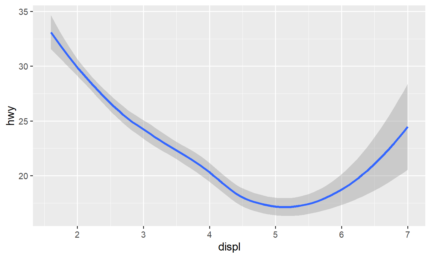
ggplot(data = mpg, mapping = aes(x = displ, y = hwy)) +
  geom_smooth(se = FALSE)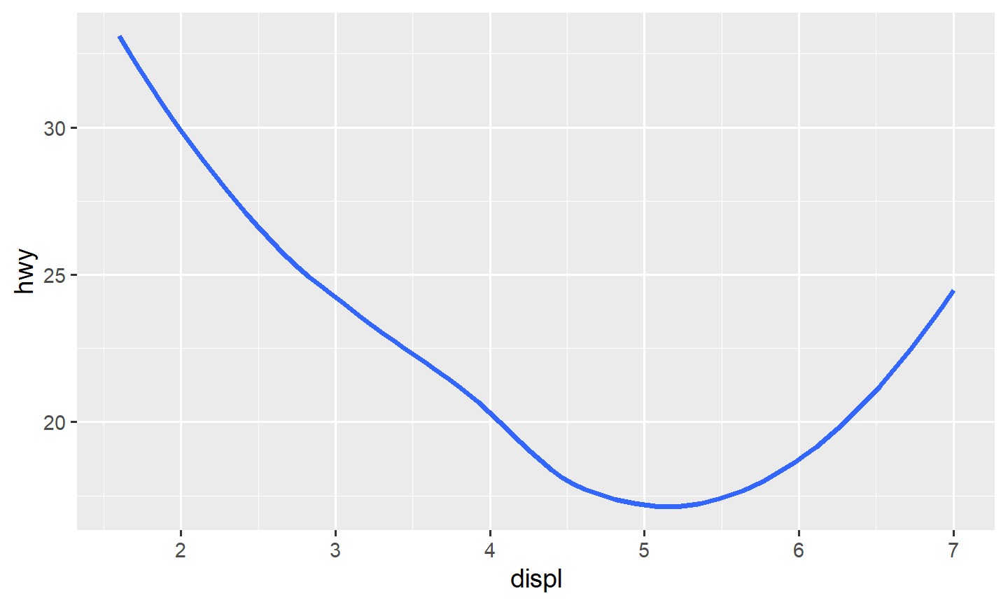
se = FALSE drops the band. A categorical mapping in
aes() gives one line per level:
ggplot(data = mpg, mapping = aes(x = displ, y = hwy, color = drv)) +
  geom_smooth(se = FALSE)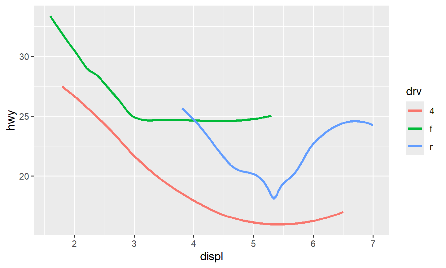
ggplot(data = mpg, mapping = aes(x = displ, y = hwy, linetype = drv)) +
  geom_smooth(se = FALSE)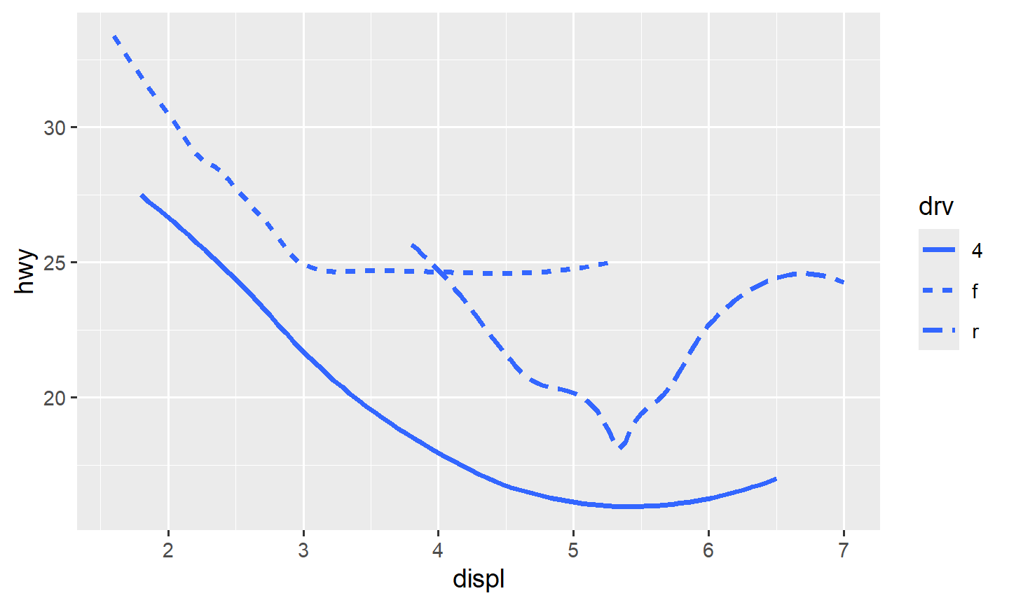
color is usually easier to read than
linetype.
method = lm is ordinary least squares. For a binary 0/1
response, method = glm with a binomial family is a logistic
curve:
ggplot(data = mpg, mapping = aes(x = displ, y = hwy)) +
  geom_point() +
  geom_smooth(se = FALSE, method = lm)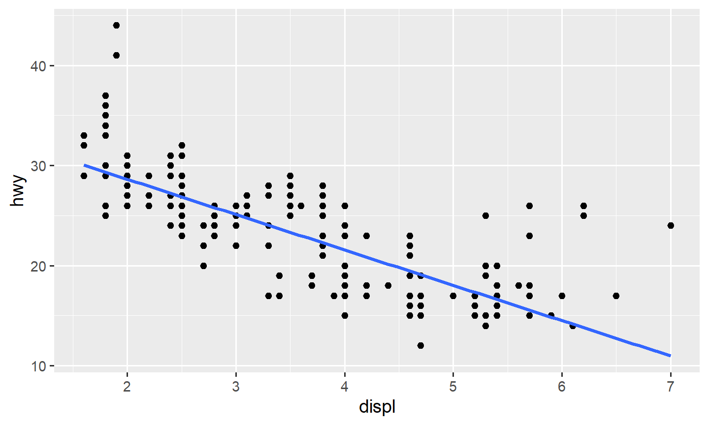
ggplot(data = mtcars, mapping = aes(x = hp, y = vs)) +
  geom_point() +
  geom_smooth(method = glm, method.args = list(family = "binomial"), se = FALSE)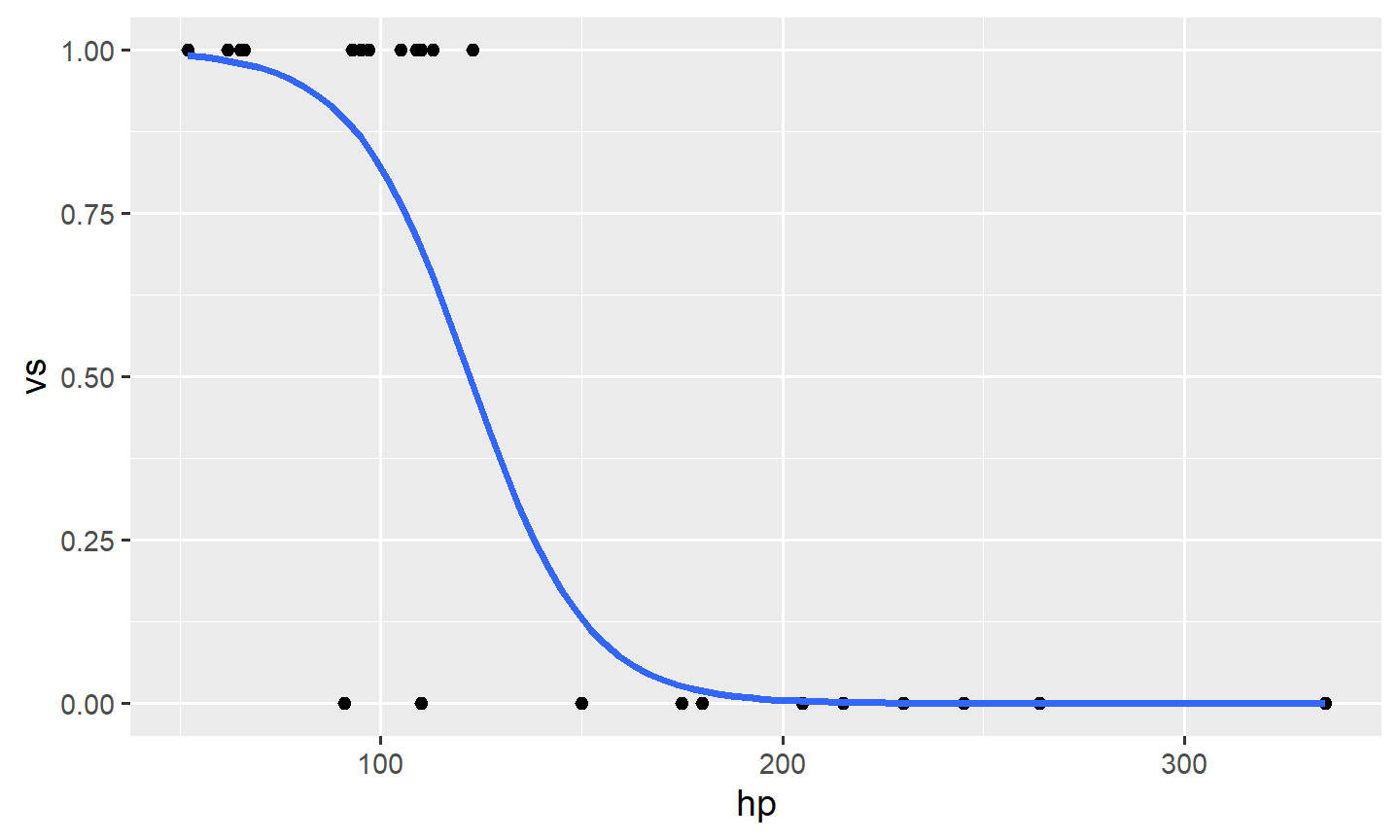
2. Where the mapping lives
ggplot(aes(...)) is the default mapping. Later geoms
inherit it unless they set their own.
ggplot(data = mpg, mapping = aes(x = displ, y = hwy)) +
  geom_point() +
  geom_smooth(se = FALSE)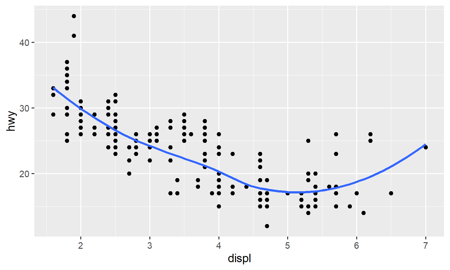
A mapping written only inside one geom stays there. Later geoms do
not see it. That is how you color the points by drv and
still get one smooth line:
ggplot(data = mpg, mapping = aes(x = displ, y = hwy)) +
  geom_point(mapping = aes(color = drv)) +
  geom_smooth(se = FALSE)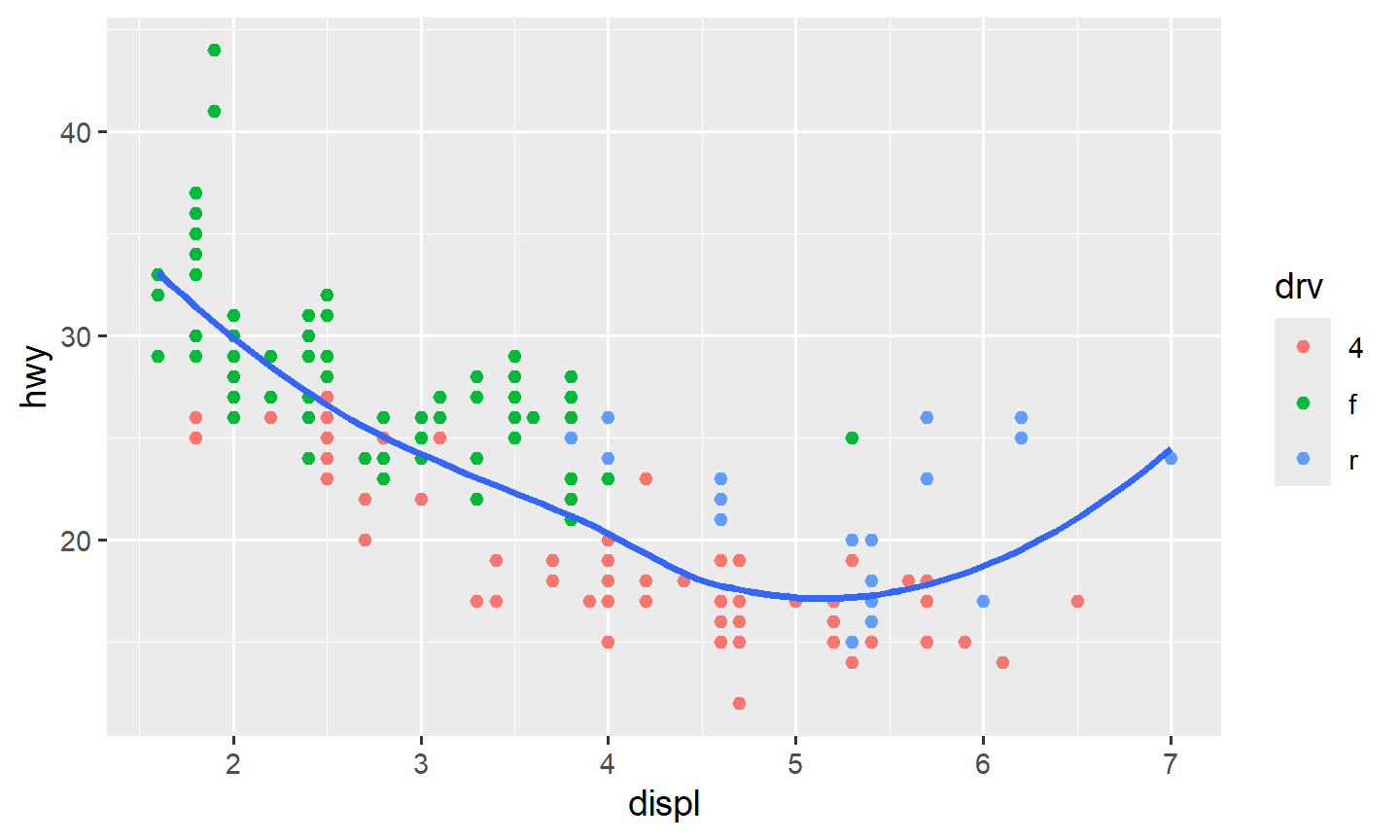
If aes(x, y) is only on geom_point(),
geom_smooth() has nothing to smooth and errors.
3. Overplotting
When many rows share the same rounded values, points sit on top of
each other. cty and hwy in mpg do
this.
Three common fixes:
- A small data set:
geom_jitter()nudges each point a little - A large data set:
geom_point(alpha = 0.1)(or smaller) - A very large data set: take a random sample first
ggplot(data = mpg, mapping = aes(x = cty, y = hwy)) +
  geom_point()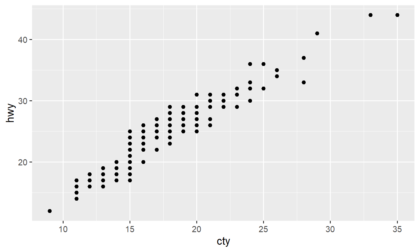
ggplot(data = mpg, mapping = aes(x = cty, y = hwy)) +
  geom_jitter()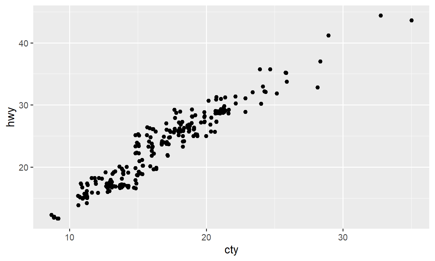
ggplot(data = mpg, mapping = aes(x = cty, y = hwy)) +
  geom_point(alpha = 0.1)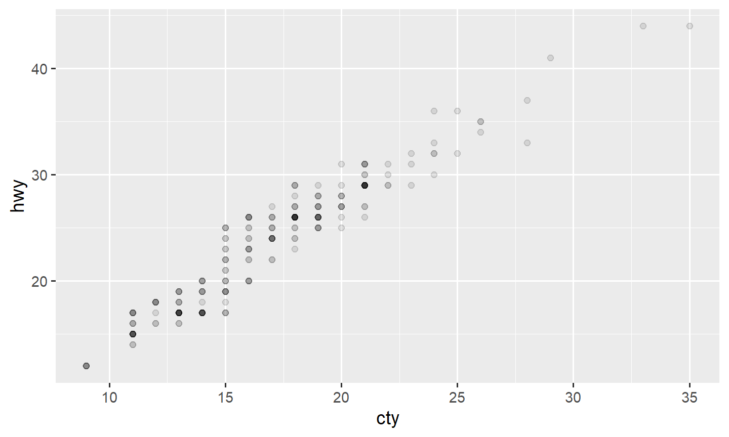
geom_hex() bins the plane into hexagons and colors by
the count. Useful when jitter and alpha are not enough:
data("diamonds")

ggplot(data = diamonds, mapping = aes(x = carat, y = price)) +
  geom_hex(bins = 50) +
  viridis::scale_fill_viridis()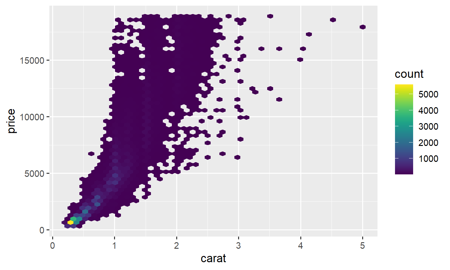
diamonds is in ggplot2. data("diamonds")
loads it.
4. One quantitative variable: histograms and densities
A histogram bins a numeric variable and counts how many values fall
in each bin. The default is 30 bins; change bins or
binwidth until the shape is readable.
ggplot(data = mpg, mapping = aes(x = hwy)) +
  geom_histogram()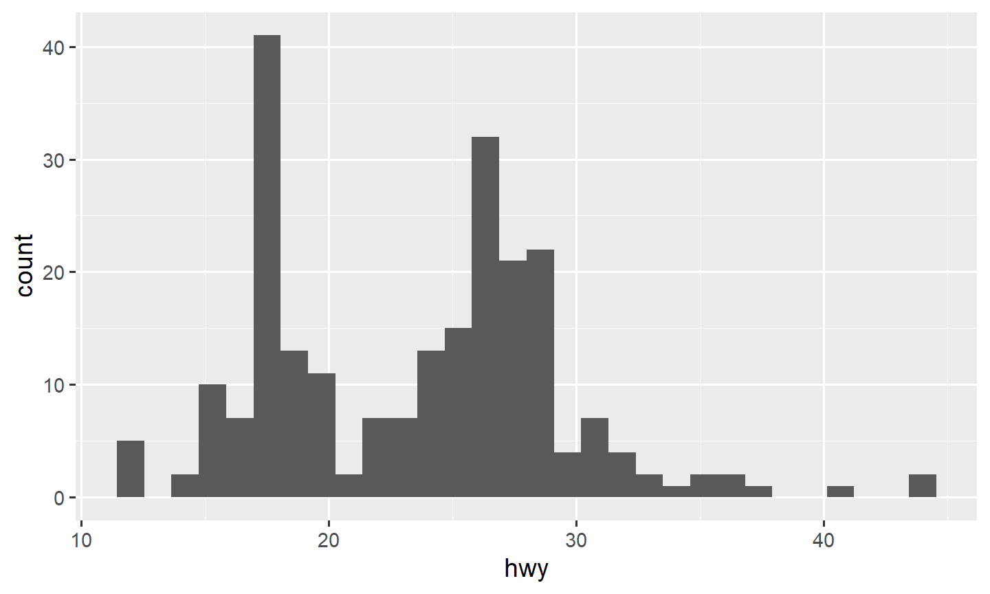
ggplot(data = mpg, mapping = aes(x = hwy)) +
  geom_histogram(bins = 20)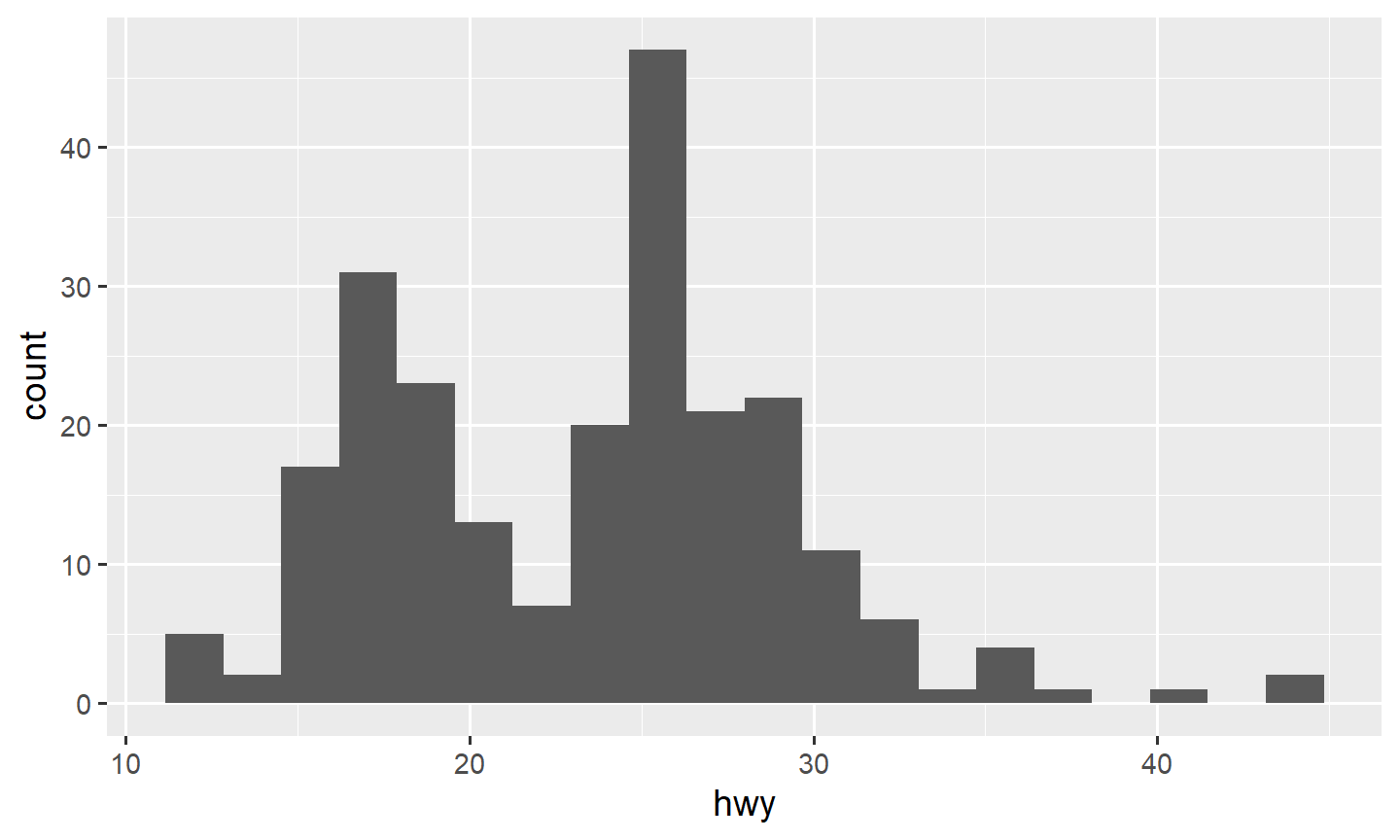
ggplot(data = mpg, mapping = aes(x = hwy)) +
  geom_histogram(binwidth = 5)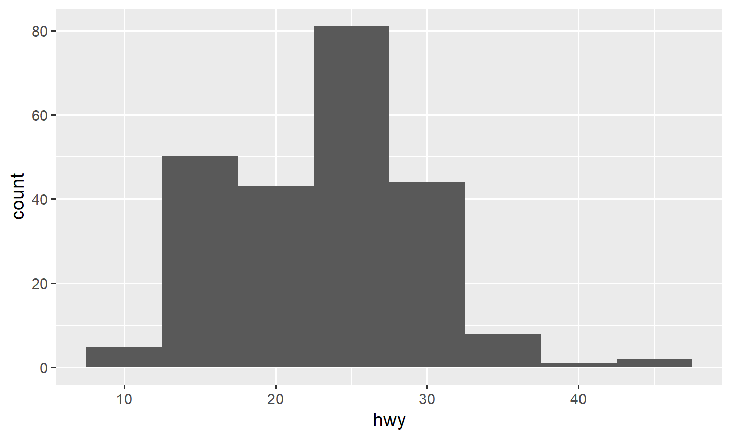
fill colors the interior of the bars. color
colors the outline. Mapping a categorical variable to fill
stacks the groups inside each bin:
ggplot(data = mpg, mapping = aes(x = hwy, fill = drv)) +
  geom_histogram(bins = 20)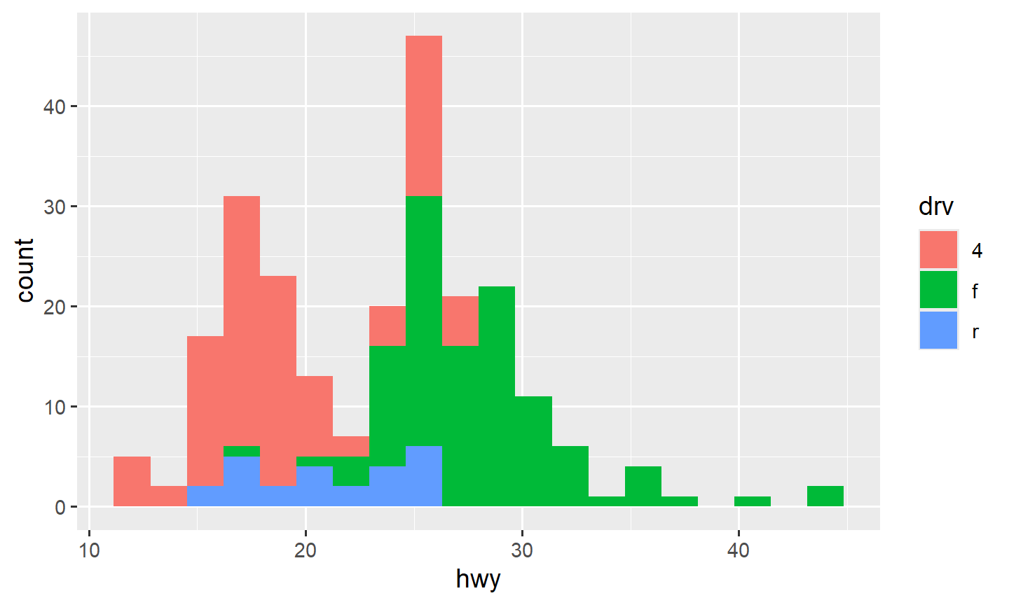
Stacked bars are hard to compare. position changes the
layout:
"identity": all groups start at zero and can hide each other; addalpha"dodge": bars side by side"fill": each bin is a proportion (the bar goes to 1)
ggplot(data = mpg, mapping = aes(x = hwy, fill = drv)) +
  geom_histogram(bins = 20, position = "identity", alpha = 0.3)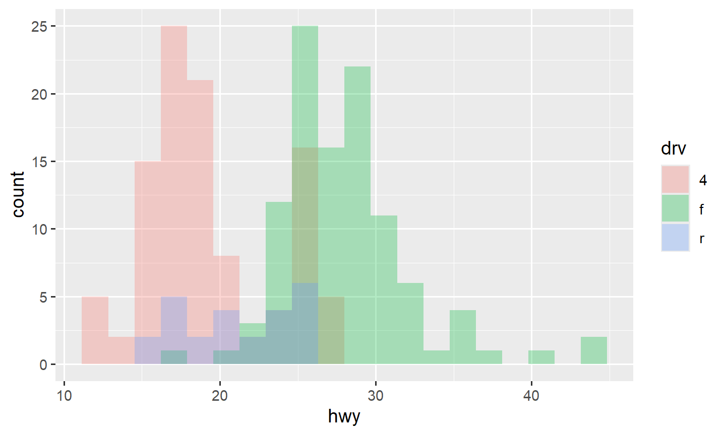
ggplot(data = mpg, mapping = aes(x = hwy, fill = drv)) +
  geom_histogram(bins = 20, position = "dodge")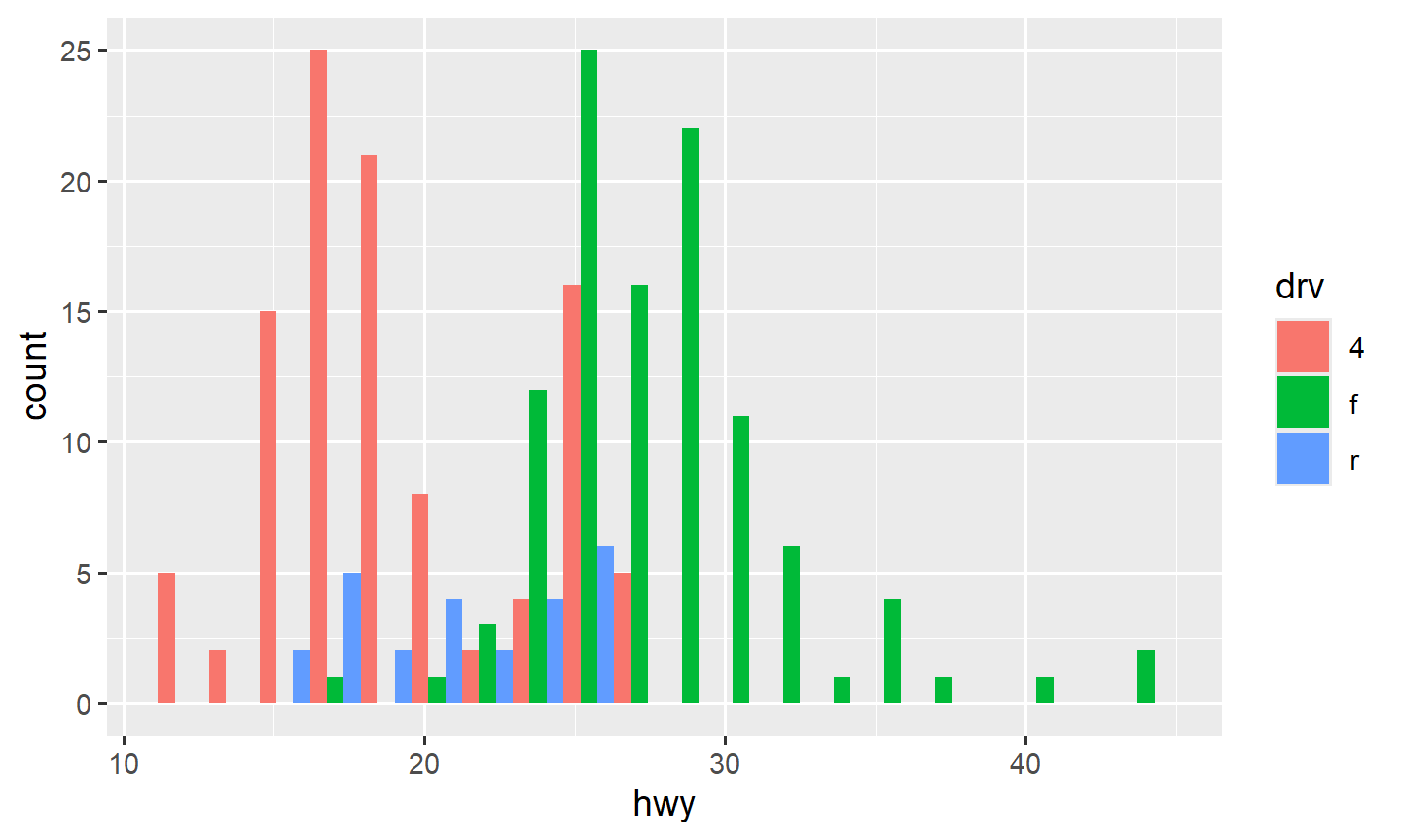
ggplot(data = mpg, mapping = aes(x = hwy, fill = drv)) +
  geom_histogram(bins = 20, position = "fill")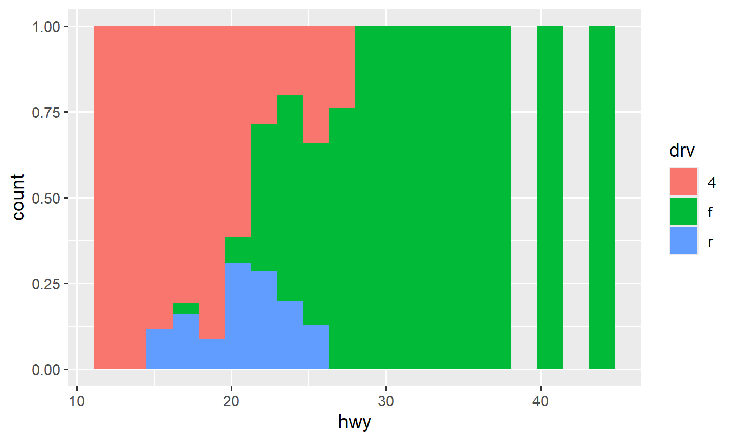
A density is a smoothed histogram:
ggplot(data = mpg, mapping = aes(x = hwy)) +
  geom_density()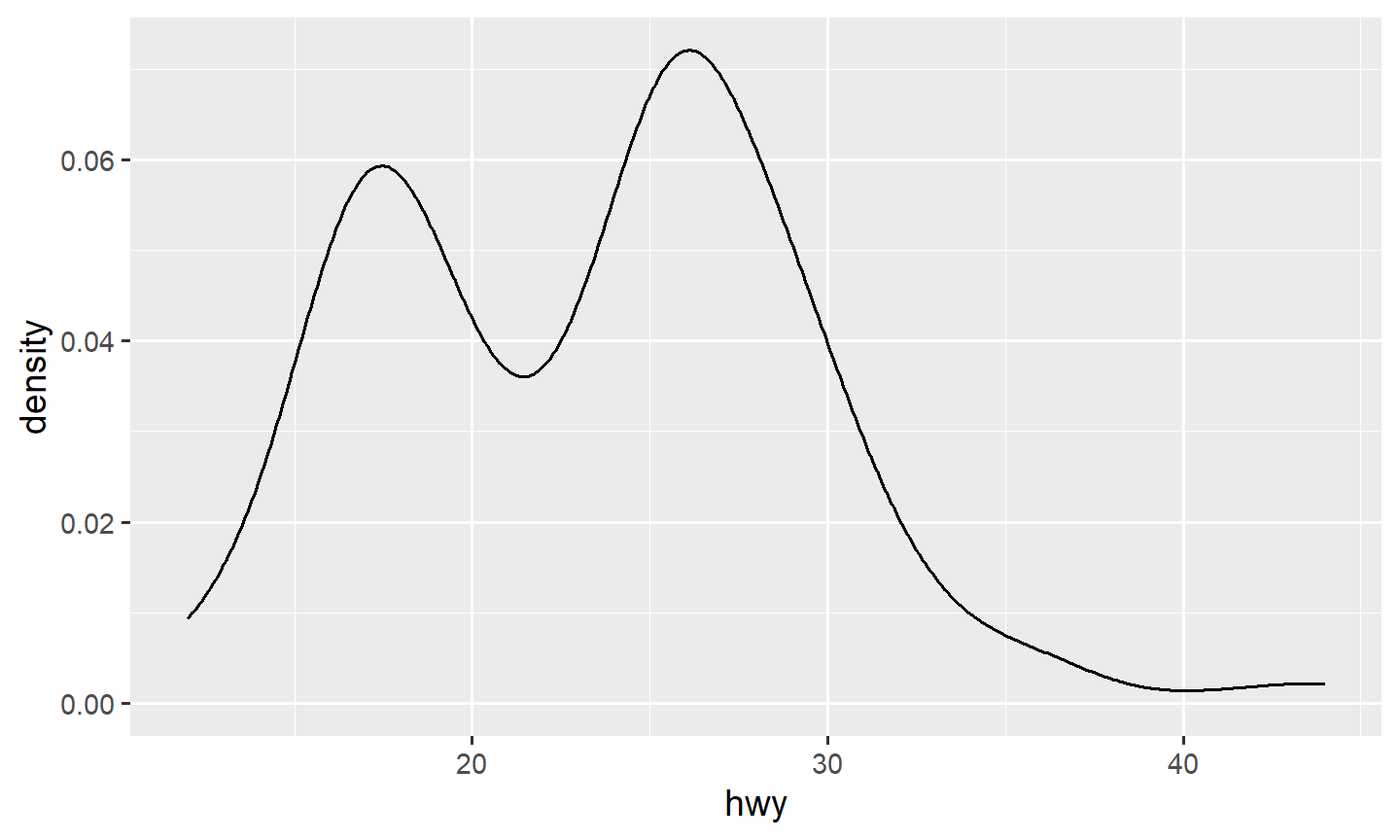
ggplot(data = mpg, mapping = aes(x = hwy, fill = drv)) +
  geom_density(alpha = 0.3)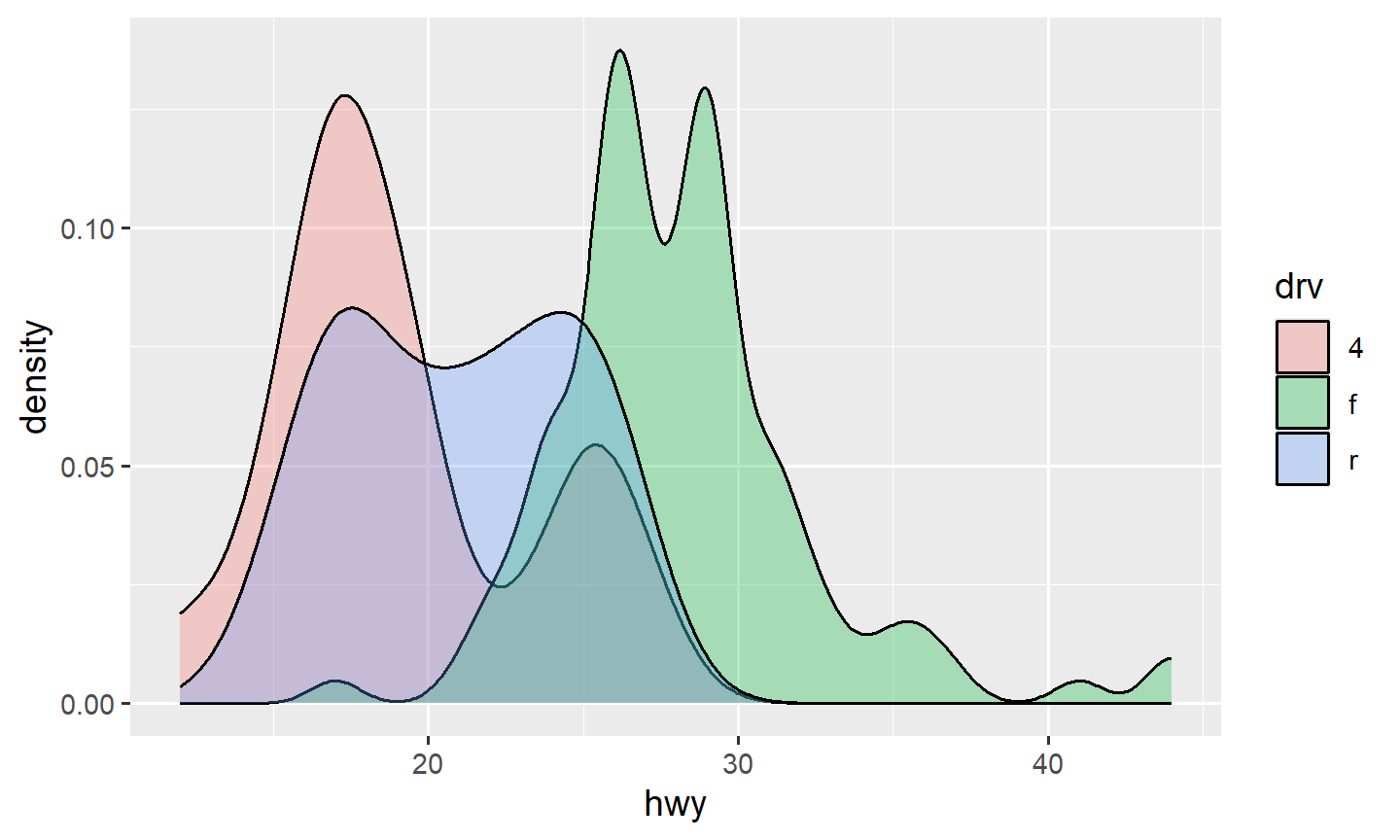
5. One categorical and one quantitative: boxplots
A boxplot shows the median, the 25th and 75th percentiles (the box, whose height is the IQR), whiskers out to 1.5 IQR from the hinges, and points beyond that.
ggplot(data = mpg, mapping = aes(x = drv, y = hwy)) +
  geom_boxplot()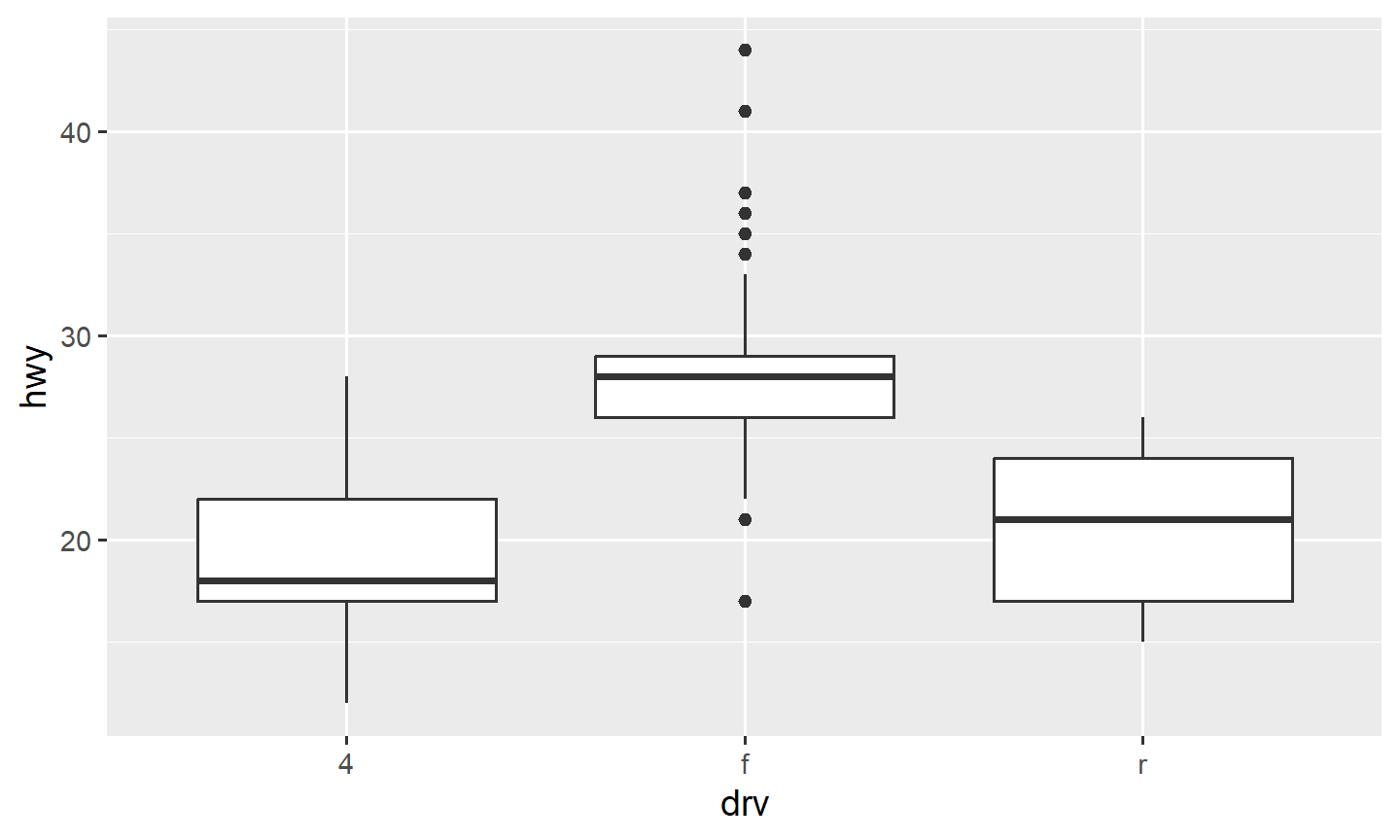
geom_violin() shows the density of the points inside the
box. ggbeeswarm::geom_beeswarm() shows every point without
stacking them on a line.
Salaries, prices, and other right-skewed variables often need a log scale. Two different jobs:
y = log(volume)changes the data. The axis ticks are logs.scale_y_log10()changes the axis. The ticks are still in the original units, spaced on a log scale.
txhousing |>
  ggplot(aes(x = as.factor(year), y = volume)) +
  geom_boxplot()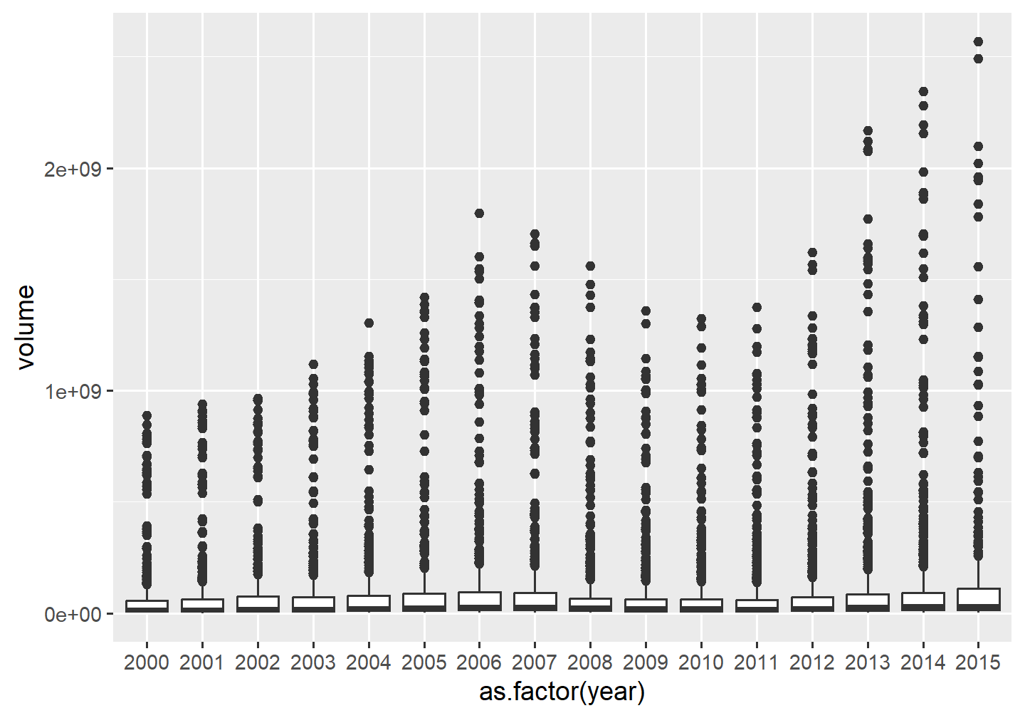
txhousing |>
  ggplot(aes(x = as.factor(year), y = volume)) +
  geom_boxplot() +
  scale_y_log10()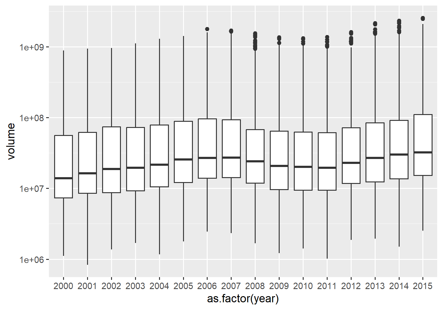
txhousing is in ggplot2.
6. Practice
Scatterplot petal length vs petal width. Color the points by species. Add one linear smooth (
method = lm) that ignores species.Plot
pricevscaratindiamonds. Fix the overplotting.Histogram of diamond
price, filled bycut.Boxplot of diamond price by
cuton a log-yscale. Does Ideal look cheaper? Checkcaratthe same way.