
3.3 ggplot2: Facets, Themes, and Saving
Facet to add a category, set a theme and a scale, then
ggsave() the object.
1. Facets
Facets make a panel for each level of a categorical variable. That is often clearer than twenty colors on one panel.
facet_wrap(~ class) wraps one variable into a grid:
ggplot(data = mpg, mapping = aes(x = displ, y = hwy)) +
  geom_point() +
  facet_wrap(~ class)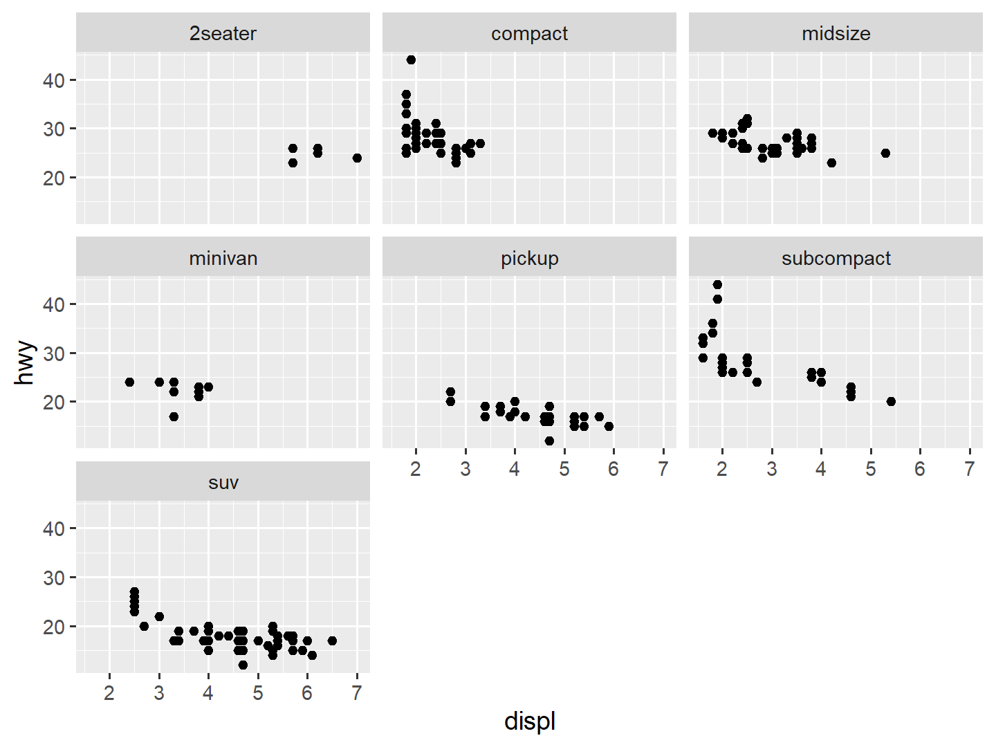
facet_grid(rows ~ cols) is a matrix of two
categoricals:
ggplot(data = mpg, mapping = aes(x = displ, y = hwy)) +
  geom_point(alpha = 0.3) +
  facet_grid(drv ~ class)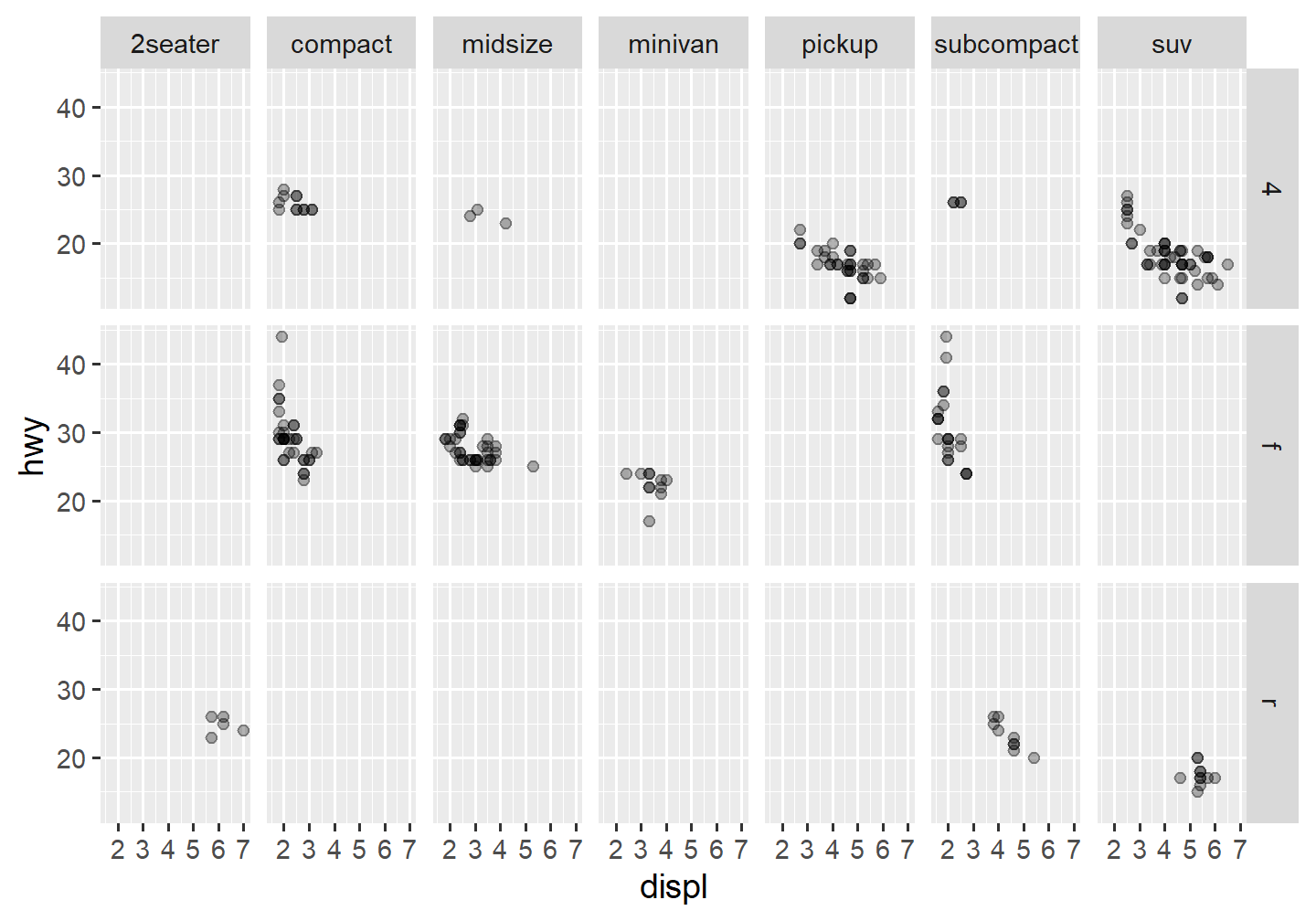
A . means “no faceting on that side”:
ggplot(data = mpg, mapping = aes(x = displ, y = hwy)) +
  geom_point() +
  facet_grid(class ~ .)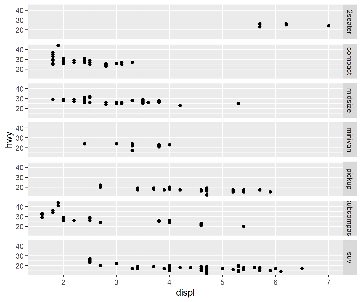
ggplot(data = mpg, mapping = aes(x = displ, y = hwy)) +
  geom_point() +
  facet_grid(. ~ drv)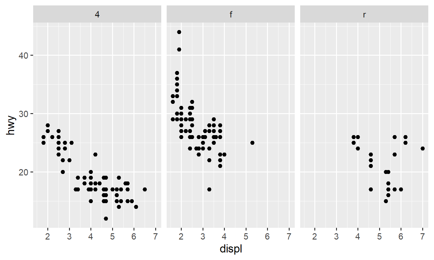
2. A fixed color is not a mapping
To make every point blue, set color
outside aes():
ggplot(data = mpg, mapping = aes(x = displ, y = hwy)) +
  geom_point(color = "blue")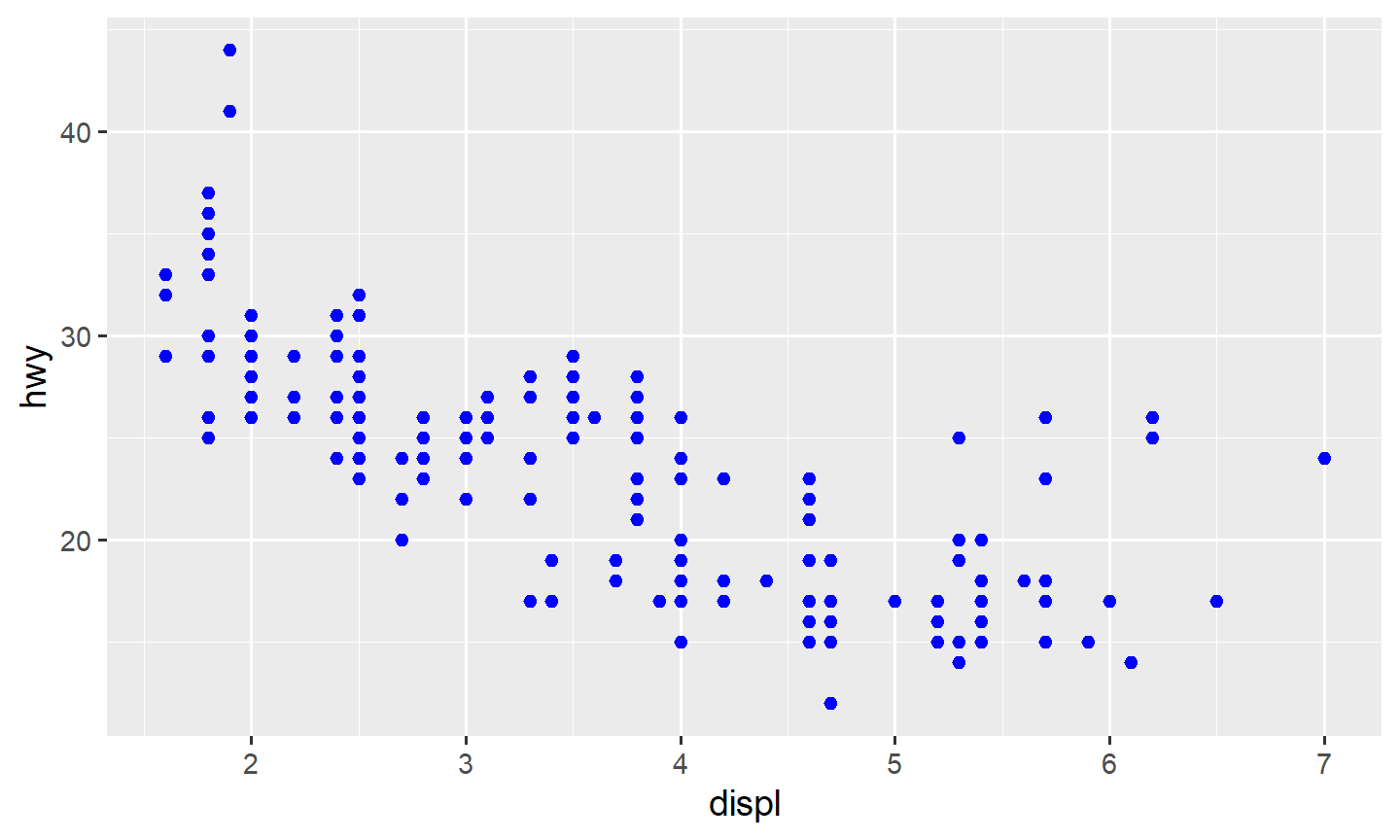
The name is a character, so it is in quotes. Inside
aes(), ggplot2 treats "blue" as a one-level
categorical variable and draws a legend for it. That is a common
mistake:
ggplot(data = mpg, mapping = aes(x = displ, y = hwy, color = "blue")) +
  geom_point()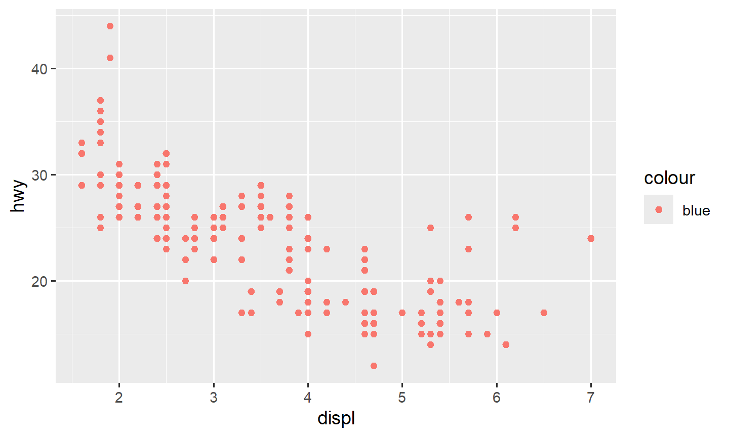
The same rule applies to histograms. fill is the
interior; color is the outline:
ggplot(data = mpg, mapping = aes(x = hwy)) +
  geom_histogram(bins = 25, fill = "white", color = "black")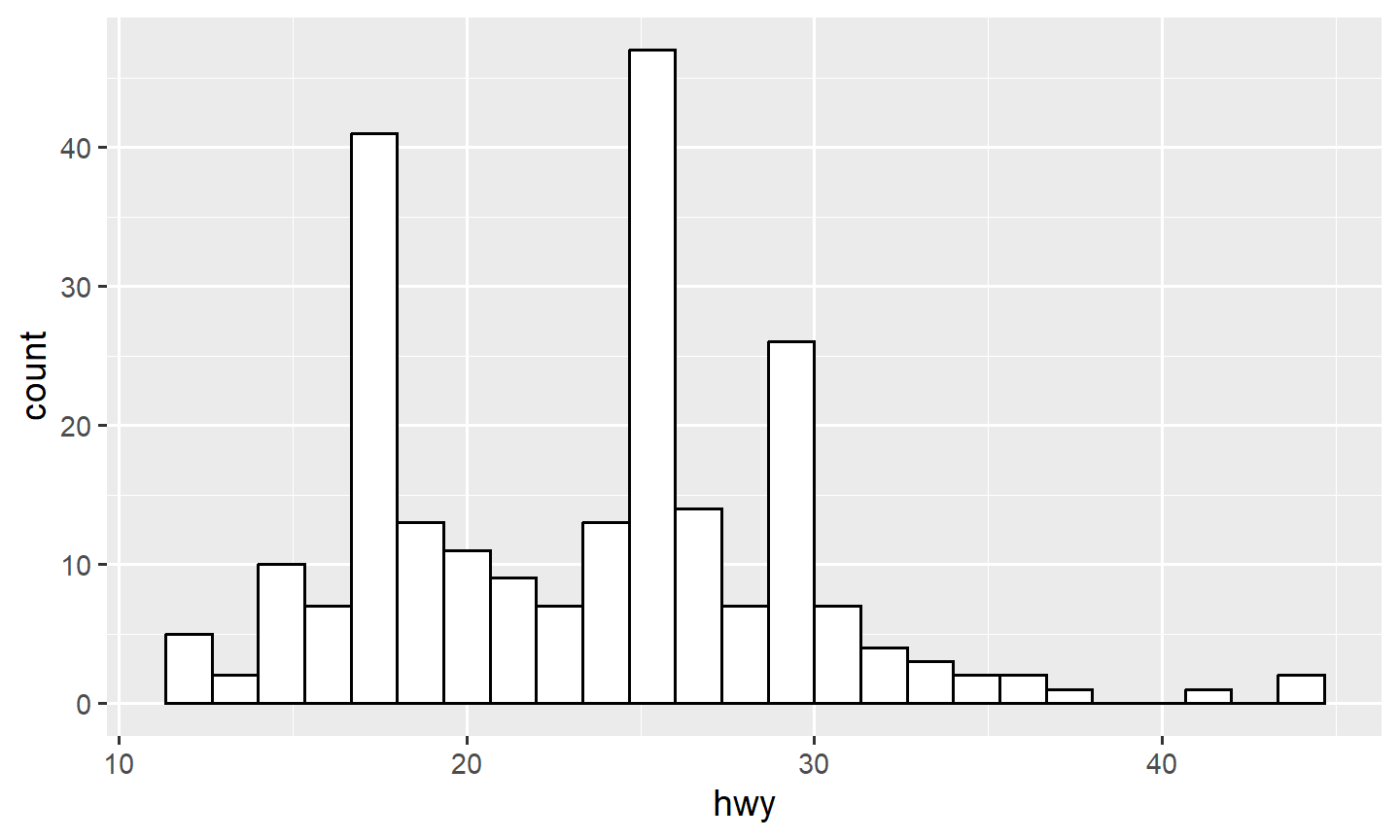
3. Themes
A theme sets the background, grid, and fonts in one step.
theme_bw() is a usual choice for a document.
theme_classic() is quieter.
ggplot(data = mpg, mapping = aes(x = displ, y = hwy, color = class)) +
  geom_point() +
  theme_bw()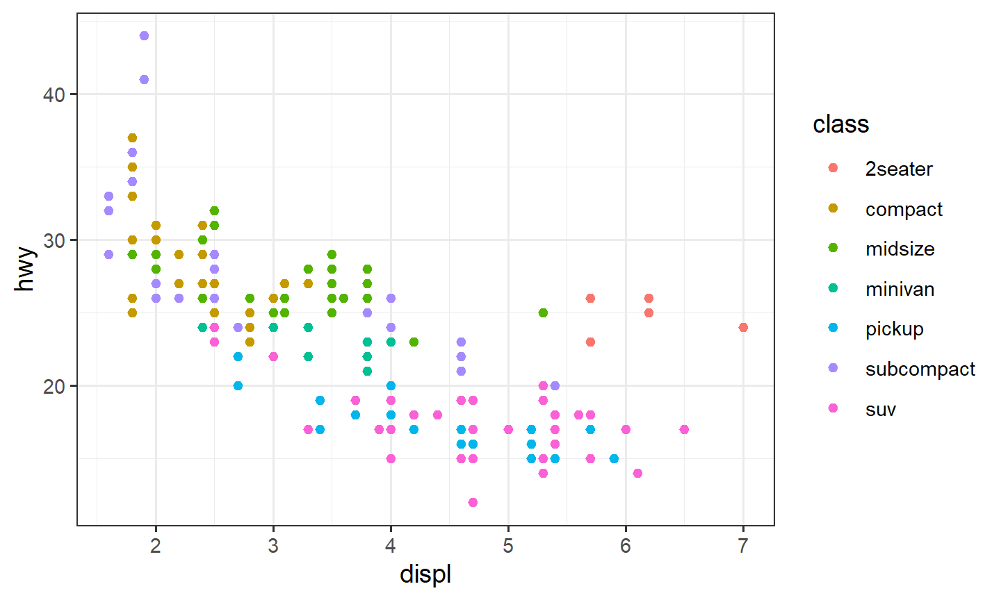
ggthemes adds more, including
theme_economist() and theme_fivethirtyeight().
Load the package first.
4. Scales and colorblind palettes
A scale maps data values to visual values. You can set the ends of a continuous color scale, or log both axes:
ggplot(data = mpg, mapping = aes(x = displ, y = hwy, color = cty)) +
  geom_point() +
  scale_color_continuous(low = "black", high = "white")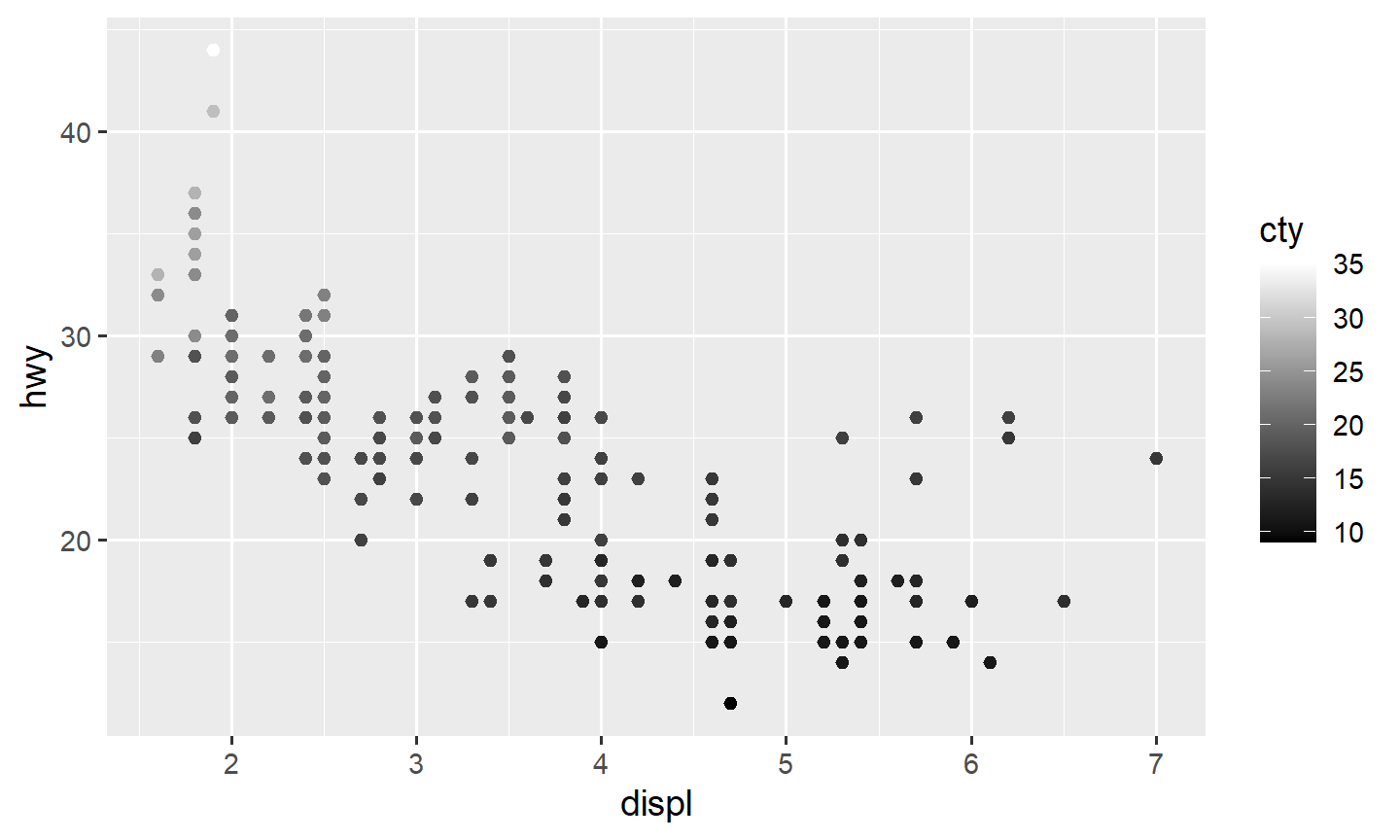
ggplot(data = diamonds, mapping = aes(x = carat, y = price)) +
  geom_point(alpha = 0.01) +
  scale_x_log10() +
  scale_y_log10()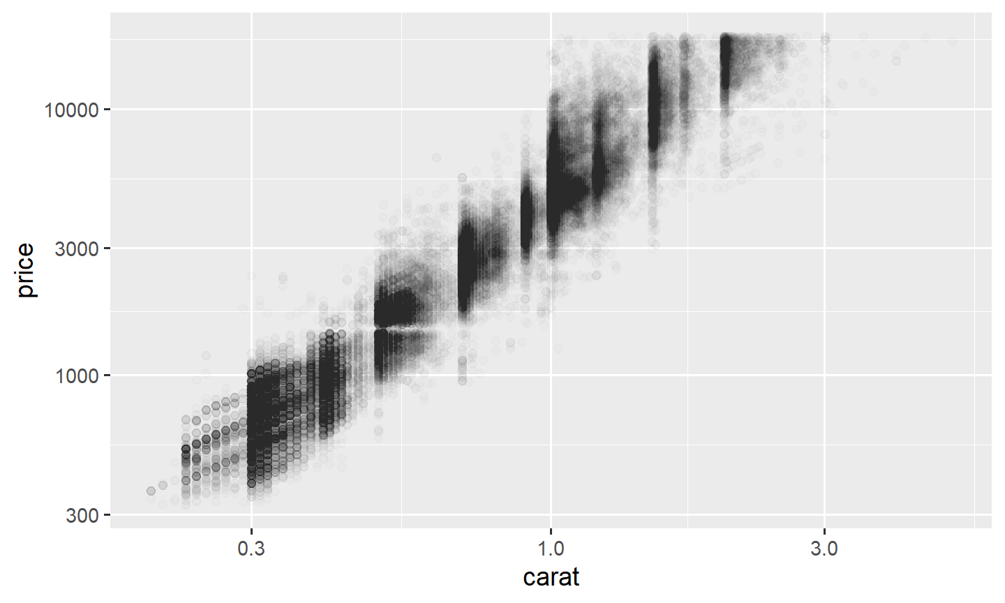
For a plot you will share, use a colorblind-safe palette.
ggthemes::scale_color_colorblind() and
scale_fill_colorblind() are one option. viridis is another:
colorful, perceptually even, and still readable in grayscale. Use
scale_color_viridis_d() /
scale_fill_viridis_d() for discrete groups and
_c for continuous.
ggplot(data = mpg, mapping = aes(x = displ, y = hwy, color = class)) +
  geom_point() +
  theme_bw() +
  scale_color_colorblind()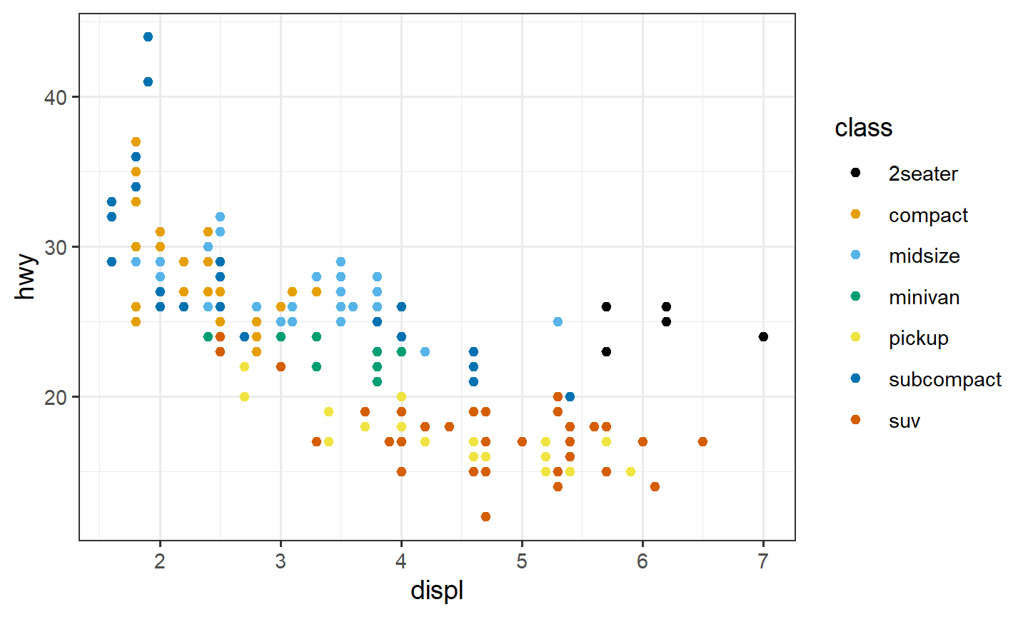
ggplot(data = mpg, mapping = aes(x = hwy, fill = drv)) +
  geom_histogram(position = "dodge", bins = 15) +
  theme_bw() +
  scale_fill_viridis_d()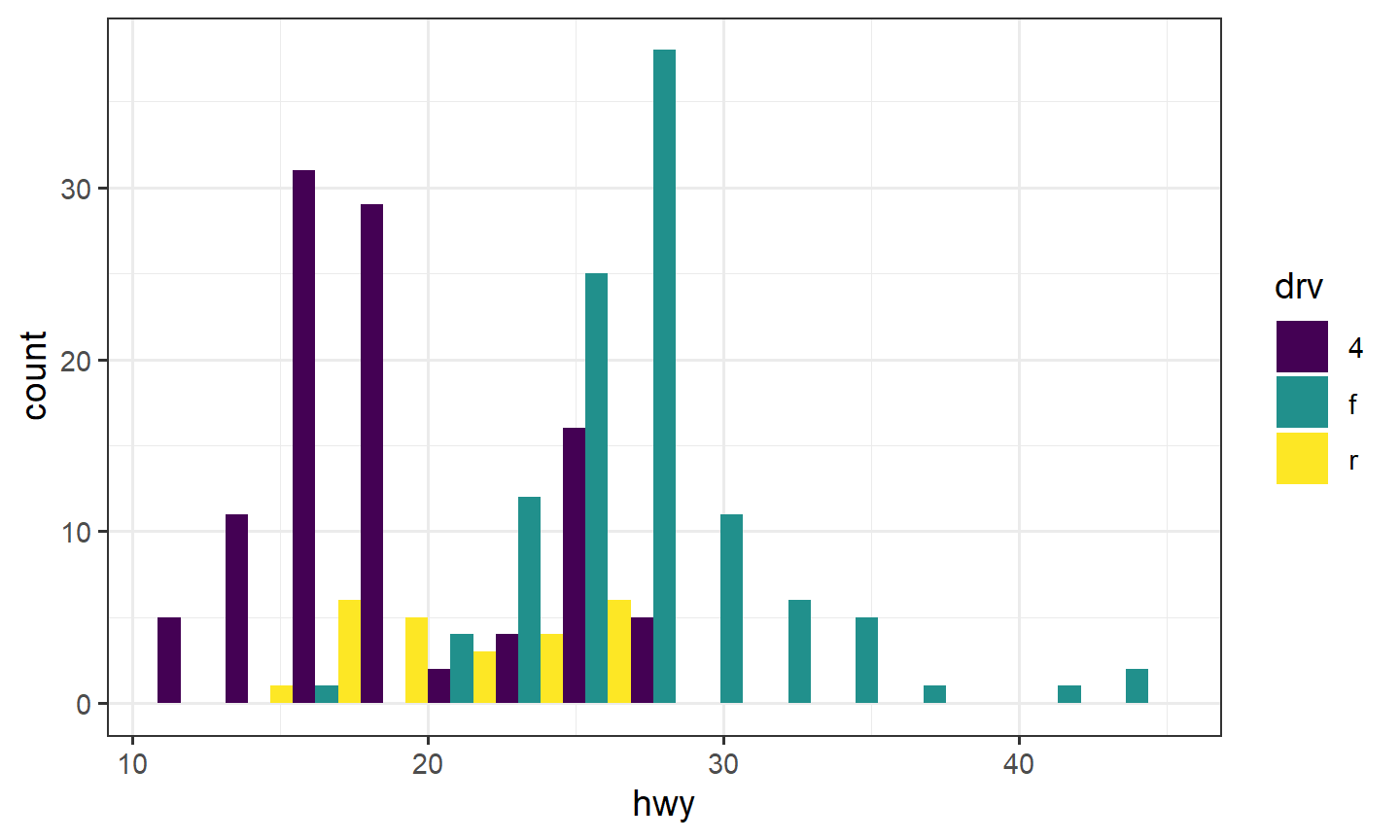
5. Labels
xlab(), ylab(), and ggtitle()
set the axis titles and the main title. The legend title is an argument
on the scale (name = ...).
ggplot(data = mpg, mapping = aes(x = displ, y = hwy, color = class)) +
  geom_point() +
  theme_bw() +
  scale_color_discrete(name = "Car Class") +
  xlab("Displacement") +
  ylab("Highway") +
  ggtitle("Displacement vs Highway")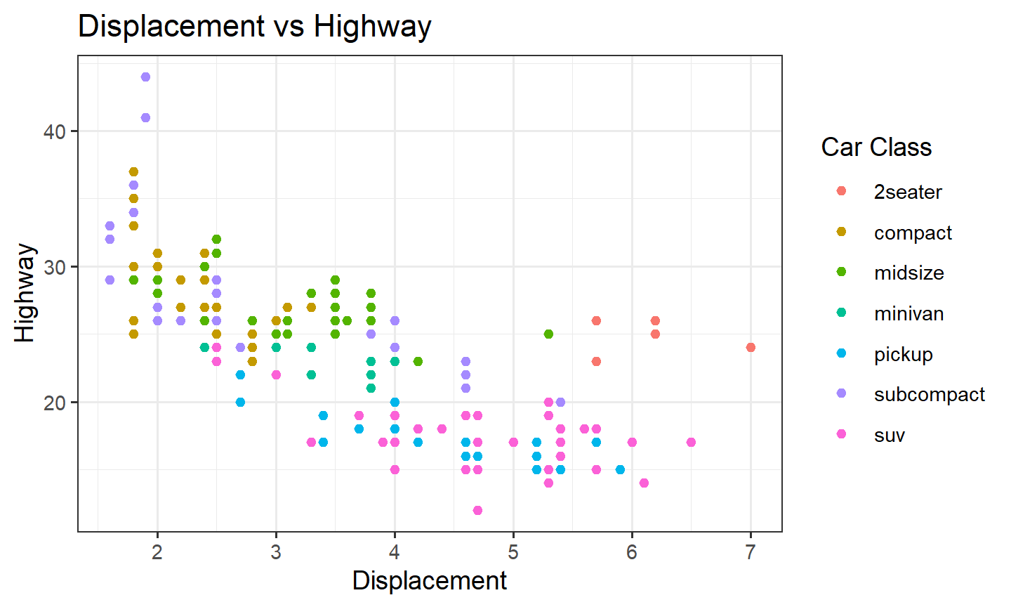
6. Saving a plot
A ggplot is an object. Assign it, print it, then export.
pl <- ggplot(data = mpg, mapping = aes(x = displ, y = hwy, color = class)) +
  geom_point() +
  theme_bw()

pl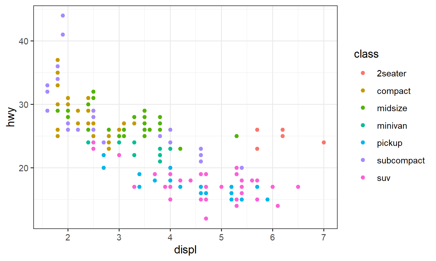
In RStudio, Export in the Plots pane writes a file.
In a script or Quarto document, ggsave() does the same. It
overwrites without asking.
ggsave("hwy-vs-displ.pdf", plot = pl, width = 6, height = 4)If you omit plot, ggsave() uses the last
plot you printed. Put the file in a folder you already have, or create
one first.
7. This week, in one place
By the end of Week 3 you should be able to:
- build a plot with
ggplot(),aes(), and ageom_*() - choose a geom from the variables: scatter (two quantitative), histogram or density (one quantitative), boxplot (one categorical and one quantitative)
- map a third variable with
color,fill, or facets - add a smooth, fix overplotting, change a theme and a scale
- label the plot and save it with
ggsave()
Functions from this week include ggplot(),
aes(), geom_point(),
geom_smooth(), geom_jitter(),
geom_hex(), geom_histogram(),
geom_density(), geom_boxplot(),
facet_wrap(), facet_grid(),
theme_bw(), scale_y_log10(),
xlab(), ylab(), ggtitle(), and
ggsave().
Chapter 3 of R for Data Science and the ggplot2 cheat sheet are the usual references.
8. Practice
Boxplots of diamond
pricevscut, log-y, faceted bycolor.The same plot: orange boxes,
theme_bw().Save that plot with
ggsave().