
3.1 ggplot2: The Grammar of Graphics
A plot is data, a mapping, and a geom. ggplot() is the
canvas; + adds a layer.
1. Why we plot
Numbers do not tell the whole story. Anscombe’s quartet is four data sets with the same means, variances, and correlation. The scatterplots are not the same: one is a line, one is a curve, one is a line with an outlier, one is a vertical stack with an outlier. The Datasaurus dozen is the same idea with a T-Rex in it.
Plot when you explore and when you explain. Do not add decoration that does not carry information.
R has three plotting systems:
- Base R: start a blank plot, then add pieces (
plot(),lines(),rug()) lattice: one large function callggplot2: layers that follow a grammar of graphics
This course uses ggplot2. It comes with
library(tidyverse). You do not load it again.
data("mpg")mpg is a tibble of cars: engine size
(displ), city and highway mpg (cty,
hwy), drive (drv), class, and more. Type
?mpg.
A Base R scatterplot with a loess curve and rugs takes several unconnected calls. The ggplot2 version is one chain:
ggplot(mpg, mapping = aes(x = displ, y = hwy)) +
  geom_point() +
  geom_smooth(se = FALSE, method = loess) +
  geom_rug() +
  xlab("Displacement") +
  ylab("Highway")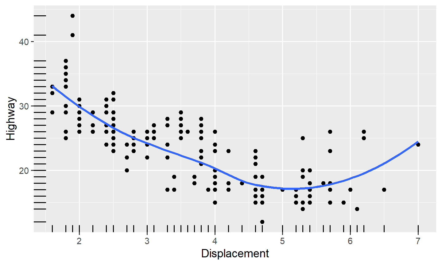
qplot() is a short ggplot2 helper for a quick look. We
will write ggplot() so the layers stay visible.
2. The grammar, in four pieces
The grammar of graphics treats a plot as layers. You can get most of the work done with four of them:
- data: a data frame
- aesthetic mappings: which column is
x,y,color,shape,size,alpha,fill, … Created withaes() - geoms: the marks,
geom_point(),geom_histogram(),geom_boxplot(), … - facets: a panel per level of a categorical
variable,
facet_wrap()orfacet_grid()
There are also stats (binning for a histogram), positions (jitter, dodge, stack), and coordinate systems. We will change those when we need them.
ggplot() makes the canvas. It needs data (a
data frame) and, usually, mapping = aes(...).
ggplot(data = mpg, mapping = aes(x = displ, y = hwy))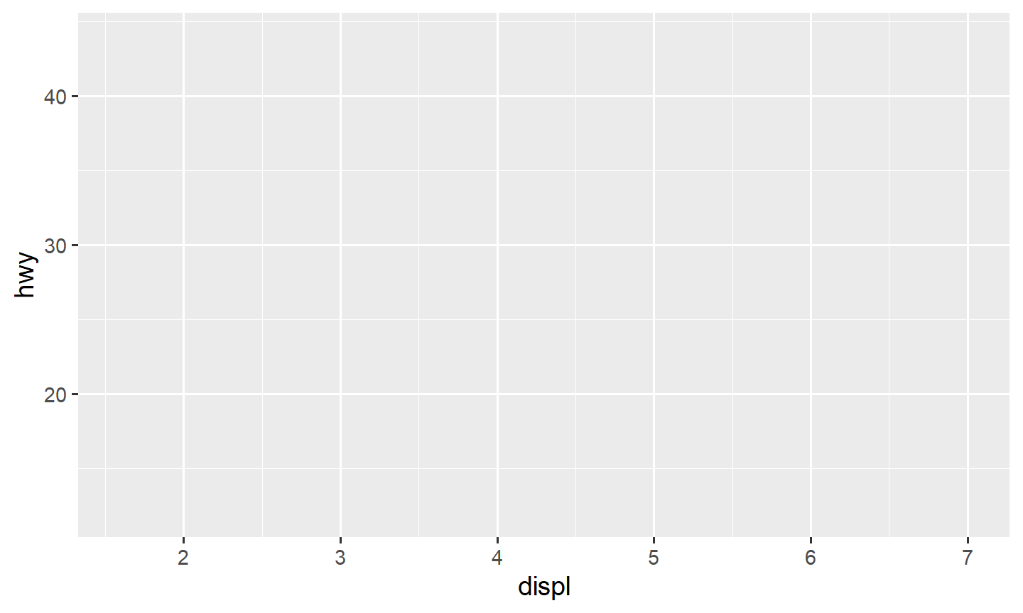
That draws axes and an empty panel. There is no geom yet.
Add a layer with + at the end of the
line, then the next function on the next line. A + at the
start of a line will error.
ggplot(data = mpg, mapping = aes(x = displ, y = hwy)) +
  geom_point()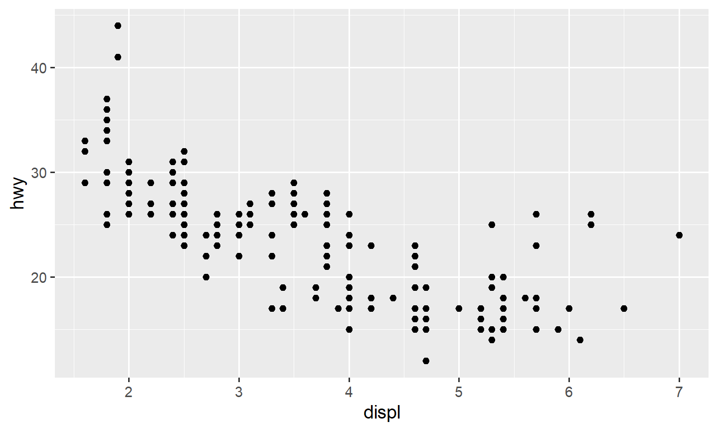
You can pipe the data in. The first argument of ggplot()
is then filled, so you only write the mapping:
mpg |>
  ggplot(mapping = aes(x = displ, y = cty)) +
  geom_point()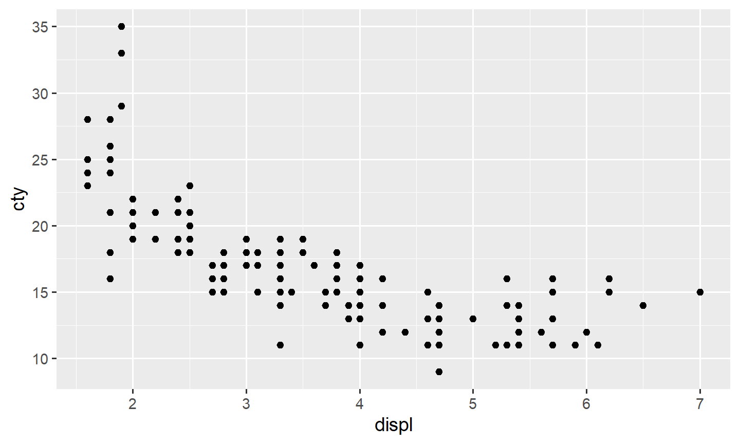
Larger displ goes with smaller cty: a
negative relationship.
3. Which variable is x
You choose the axes from the question. The response usually goes on
y. The explanatory variable goes on x.
“Plot A vs B” and “plot A as a function of B” both put B on
x and A on y. Swapping the axes does not
change the association. It does change what a reader thinks is doing the
explaining.
ggplot(data = mpg, mapping = aes(x = cty, y = hwy)) +
  geom_point()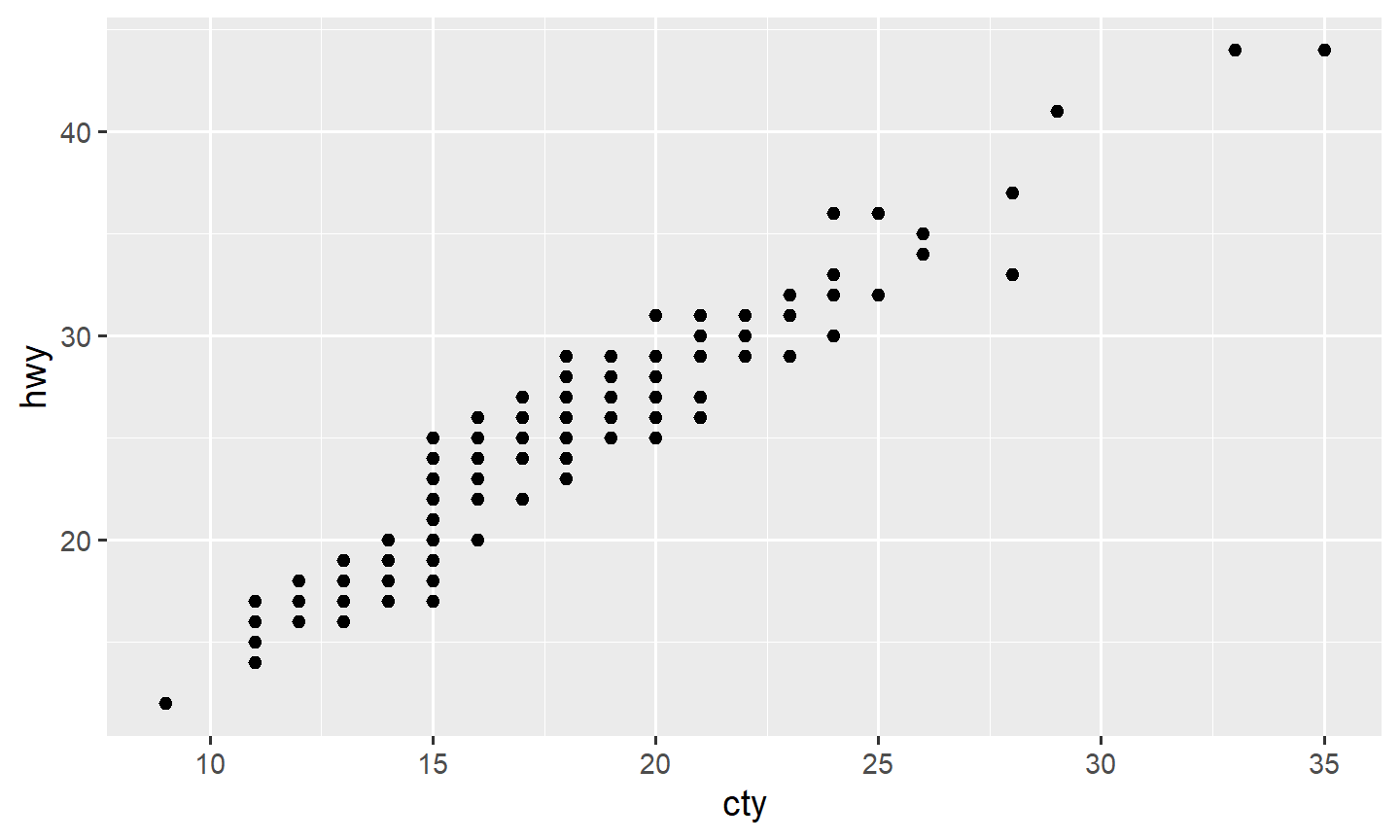
cty and hwy move together: a positive
relationship.
4. A third variable: categorical
A categorical variable has a short list of groups. In
mpg, drv is f (front),
r (rear), or 4.
Map it to color (usually clearer) or shape
(harder once you have many levels):
ggplot(data = mpg, mapping = aes(x = displ, y = hwy, color = drv)) +
  geom_point()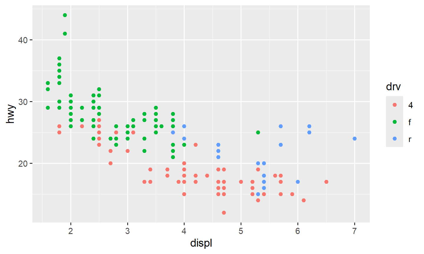
ggplot(data = mpg, mapping = aes(x = displ, y = hwy, shape = drv)) +
  geom_point()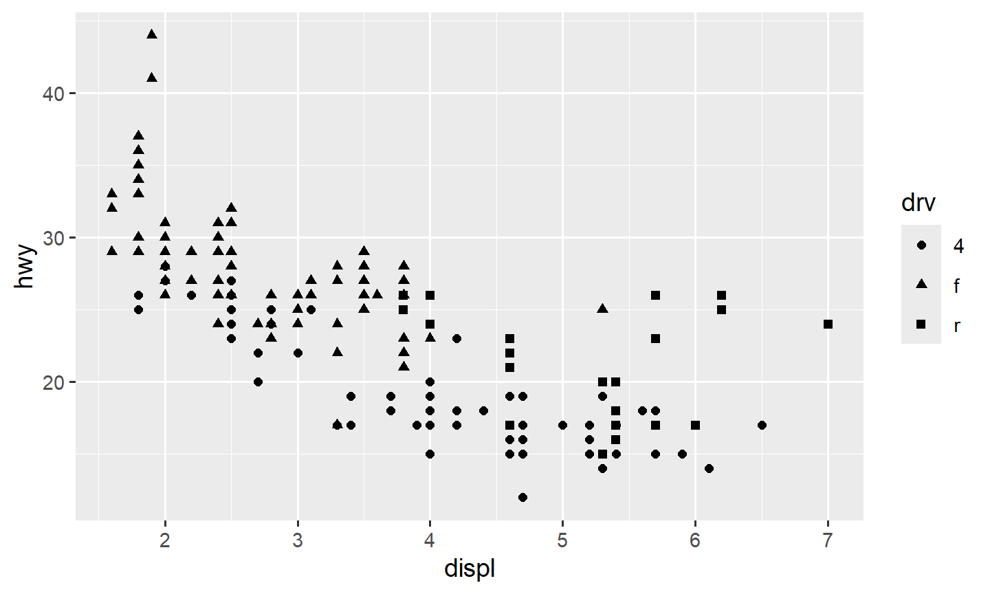
Fifty states as fifty colors is a mess. Recode into fewer groups, or facet (note 3.3).
size and alpha have a natural order (small
to large, faint to dark). A categorical variable usually does not.
Mapping drv to size or alpha is
legal and usually a bad idea.
5. A third variable: quantitative
A third number can go on color (a spectrum),
alpha (transparency), or size (a bubble chart;
worst when points overlap).
ggplot(data = mpg, mapping = aes(x = displ, y = hwy, color = cty)) +
  geom_point()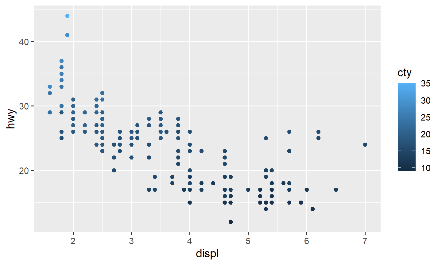
ggplot(data = mpg, mapping = aes(x = displ, y = hwy, color = cty)) +
  geom_point() +
  viridis::scale_color_viridis()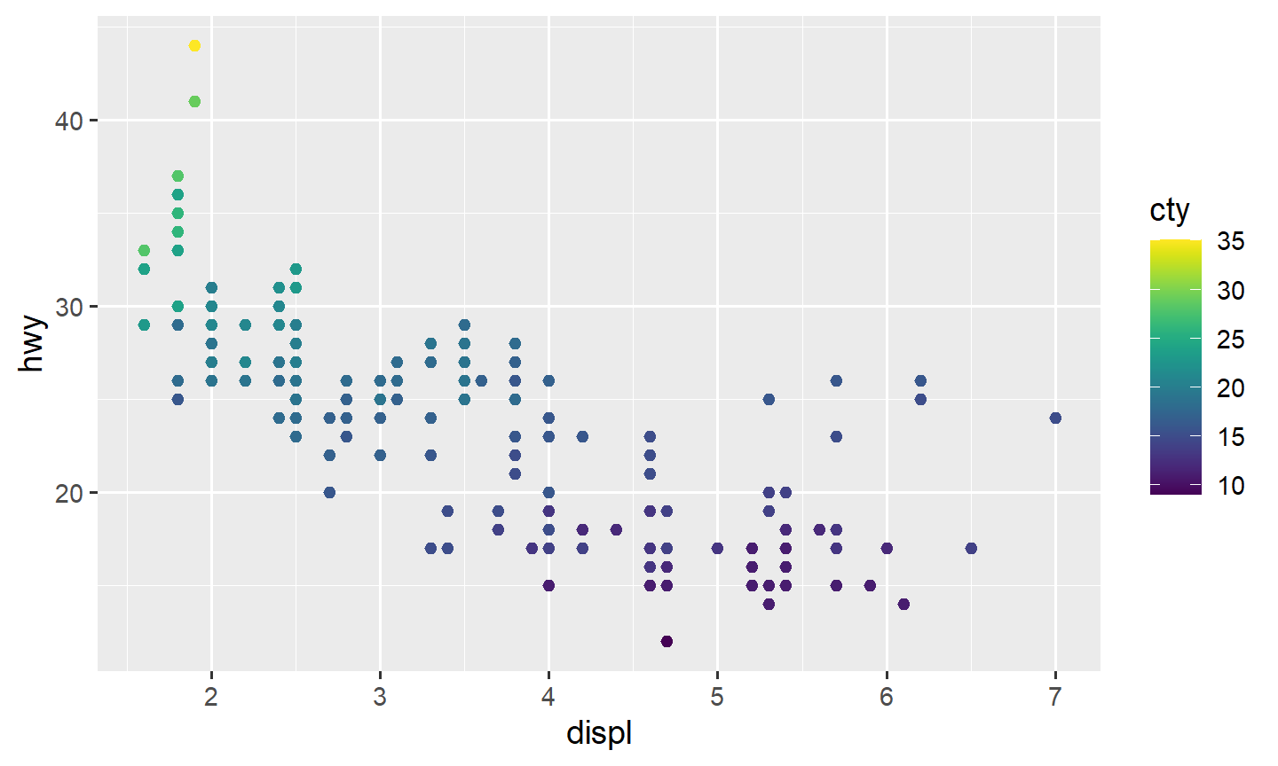
ggplot(data = mpg, mapping = aes(x = displ, y = hwy, alpha = cty)) +
  geom_point()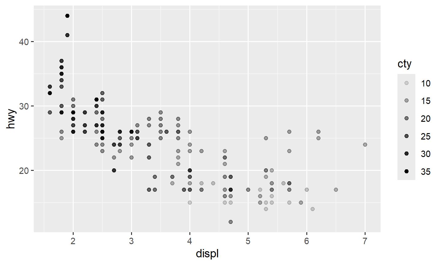
ggplot(data = mpg, mapping = aes(x = displ, y = hwy, size = cty)) +
  geom_point()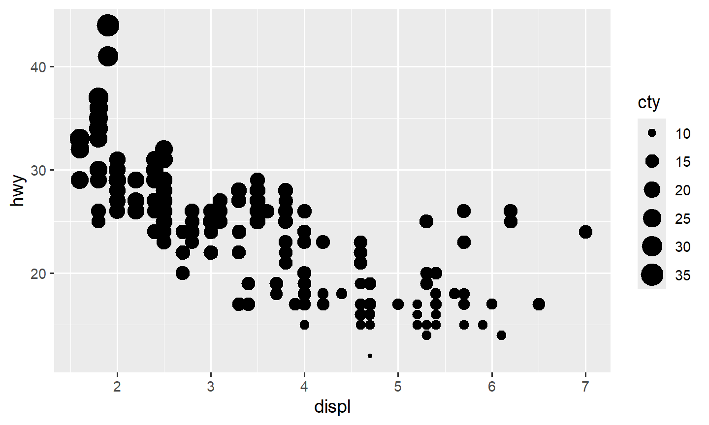
shape has a short list of symbols. Mapping a continuous
variable to shape errors.
Stacking color, size, alpha,
and shape at once is possible and usually unreadable. If
you cannot say the sentence the plot is making, drop a mapping.
6. Practice
Load
iris(data(iris);head(iris)). Which columns are quantitative? Which is categorical?Scatterplot petal length vs petal width, colored by species. What do you see?
Map a categorical column in
mpgtosizeoralpha. Why is that a poor default?